Whittling down the Whatlings?
Inspired by the Lookouts comics, the Wildlings RPG and the Wardlings miniatures, I ran an all-ages one-shot at Ettin Con last year. The players were kids and their parents, so the ages ran from single digits to late thirties (not counting the 41yo GM). I opted for a custom ruleset to get the simplicity & tone just right, and it worked fairly well, but if I’m going to run another one-shot to utilise the second wave of minis, I need to make some adjustments (and I might as well fix a bunch of things while I’m there).
Pets
There are six new spirit companions (natural or magical pets) which I needed to add to the class sheets, and some iconography for the same. I usually grab/manipulate images from game-icons.net for their clarity and simplicity. The second wave of minis adds a winged cat, stone golem, monkey, wolf, falcon and imp. Other than using a tiger for the cat (the cat icon was a little too passive, I wanted something more exciting), all of those were easy to find.
Difficulty
The session was a bit too easy (thanks for the feedback, players!) so I bothered to look at the probability for the dice pool I’d based on John Harper’s OneSevenDesign work. I’d erred on the side of safety for the young players, but three dice as a maximum pool is safe enough, and it took a session for me to discover that. I decided to further simplify the character sheet along with these rules, so that you rolled one die for any risk, plus one or two more if you had a skill, assistance, or both. Equipment was now simply for fictional positioning (enabling actions which would be impossible without), and I removed the safety net of goblin’s performing heroic self-sacrifice to protect the characters. Next, I changed the pets to have 3hp, like each character, and that HP could be spent, one for one, to raise the result of the highest die on a roll. Lethality was still lessened by the text describing exhaustion for either pet or character.
Patches
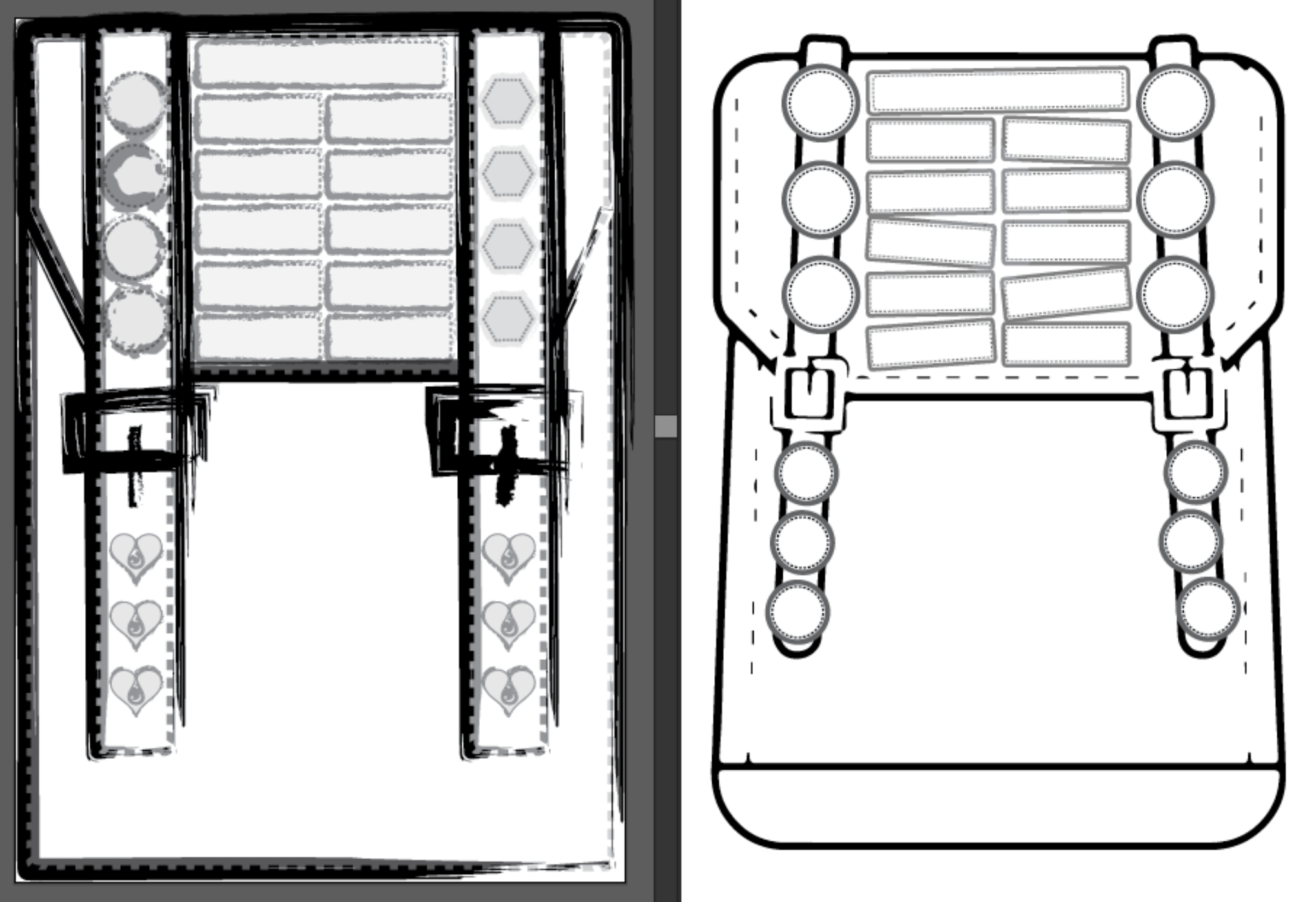
The original character sheet had lots of patches, some round and some hexagonal, but this version would have fewer, and keep them all round (cutting hexes is slow, velcro dots are already round). The players enjoy sticking the patches onto their sheets but I learned back in 2016 (running Heroes in Trouble, another proto-kid-rpg) that glue sticks at the table are a fiddly time-suck which no-one needs.
Finishing Touches
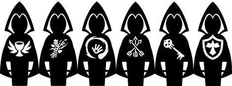
I started to wonder if this is worth cleaning up to release for other people to use. The Wardlings minis are great but even games like Hero Kids don’t really provide the support they deserve, and I want to make it easy for anyone at the convention to run a session with them as part of our RPG asset library. The class icons, borrowed from Dungeon World, are proprietary and somewhat unintuitive, especially for beginners. I would love to have clearly recognisable symbols for the classes which a newcomer would understand, but couldn’t find anything that sang to me. I’m currently toying with a mashup of icons-within-hero-sillhouette (hello Adobe Illustrator) and will see if that works for both players and my aesthetic.

I’d also like to revisit the backpack image for the character sheet. When I say “like to”, I mean “I’m not sure if I’m still satisfied with the scratchpunk style of hasty vectors but I am dreading the effort to start over and just wish I was a better visual artist” but you get the idea. It’s not thrilling me today, and I wish it would, so that might mean renewed effort and different approaches.

Next, the Adventure and Treasures
Once all this is done, I’ll need to write the adventure which has been brewing in my head, maybe a template for future ones (so others can write their own) and determine new magic items to help the characters without making things too easy. That said, I still think that the clever use of a magic item in the last session totally deserved to circumvent the final challenge!
I’ll try to add more images to this post if I get the chance.